
这是一款实用的jQuery和css3文字排版特效插件。插件中使用了一款jQuery文字插件 Lettering.js 。通过这个插件,开发者可以很容易的控制文字。
下面来分别看一下3种文字排版效果。
1、Folded Paper Effect

HTML
Fun Typography Techniques
CSS
body, html {
  height: 100%;
  margin: 0;
  -webkit-font-smoothing: antialiased;
  font-weight: 100;
  background: #aadfeb;
  text-align: center;
}
h1 {
    margin-top: 155px;
}
h1 [class*="word"]{
    margin-right: 10px;
}
h1 [class*="word"]:last-child;{
    margin-right: 0;
}
.demo1 [class*="char"]{
    font-family: 'Amatic SC', helvetica;
    background: #ffb500;
    padding: 10px;
    font-size: 60px;
    color: #fff;
    display: inline-block;
}
.demo1 [class*="char"]:nth-child(odd){
    moz-transform: skewY(-10deg);
    -webkit-transform: skewY(-10deg);
    -o-transform: skewY(-10deg);
    -ms-transform: skewY(-10deg);
    transform: skewY(-10deg);
}
.demo1 [class*="char"]:nth-child(even){
    background: #f15b14;
    color: #fff;
    moz-transform: skewY(10deg);
    -webkit-transform: skewY(10deg);
    -o-transform: skewY(10deg);
    -ms-transform: skewY(10deg);
    transform: skewY(10deg);
}
JAVASCRIPT
$(window).load(function(){
    $(".demo1").lettering("words").children('span').lettering();
});
上面的代码用来制作一种文字Folded效果。通过Lettering.js和CSS的nth-child选择器,我们可以很容易的制作这种效果。这里,我们不想给太多的阴影深度和边框效果,是为了制作一种扁平化的效果。
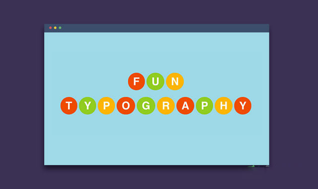
2、Party Light Effect
HTML
Fun Typography
CSS
body, html {
  height: 100%;
  margin: 0;
  -webkit-font-smoothing: antialiased;
  font-weight: 100;
  background: #9fd9e6;
  text-align: center;
}
h1 {
    margin-top: 235px;
}
h1 [class*="word"]{
    margin-right: 10px;
}
h1 [class*="word"]:last-child;{
    margin-right: 0;
}
.demo2 [class*="char"]{
    margin-right: 5px;
    line-height: 100%;
    font-family: helvetica;
    color: white;
    font-weight: bold;
    border-radius: 50px;
    text-align: center;
    display: inline-block;
    padding: 10px 15px;
    text-transform: uppercase;
}
.demo2 [class*="char"]:nth-child(3n+1) {
    background: #ed4a02;
}
.demo2 [class*="char"]:nth-child(3n+2) {
    background: #93ca31;
}
.demo2 [class*="char"]:nth-child(3n+3) {
    background: #feb300;
}
.demo2:hover [class*="char"]:nth-child(3n+1){
    -webkit-animation: color-1 1s infinite;
    -moz-animation: color-1 1s infinite;
    -o-animation: color-1 1s infinite;
    animation: color-1 1s infinite;
}
.demo2:hover [class*="char"]:nth-child(3n+2){
    -webkit-animation: color-2 1s infinite;
    -moz-animation: color-2 1s infinite;
    -o-animation: color-2 1s infinite;
    animation: color-2 1s infinite;
}
.demo2:hover [class*="char"]:nth-child(3n+3){
    -webkit-animation: color-3 1s infinite;
    -moz-animation: color-3 1s infinite;
    -o-animation: color-3 1s infinite;
    animation: color-3 1s infinite;
}
@-webkit-keyframes color-1 {
    0% { background: #ed4a02; }
    33% { background: #93ca31; }
    66% { background: #feb300; }
    100% { background: #ed4a02;}
}
@-moz-keyframes color-1 {
    0% { background: #ed4a02; }
    33% { background: #93ca31; }
    66% { background: #feb300; }
    100% { background: #ed4a02;}
}
@-webkit-keyframes color-2 {
    0% { background: #93ca31; }
    33% { background: #feb300; }
    66% { background: #ed4a02;}
    100% { background: #93ca31;}
}
@-moz-keyframes color-2 {
    0% { background: #93ca31; }
    33% { background: #feb300; }
    66% { background: #ed4a02;}
    100% { background: #93ca31;}
}
@-webkit-keyframes color-3 {
    0% { background: #feb300; }
    33% { background: #ed4a02; }
    66% { background: #93ca31;}
    100% { background: #feb300;}
}
@-moz-keyframes color-3 {
    0% { background: #feb300; }
    33% { background: #ed4a02; }
    66% { background: #93ca31;}
    100% { background: #feb300;}
}
JAVASCRIPT
$(window).load(function(){
    $(".demo2").lettering("words").children('span').lettering();
});
这个效果将为文字添加各种颜色效果。当鼠标滑过文字时,文字颜色将发生改变。这里使用CSS的 nth-child 选择器来为文字调用橙、绿、黄间隔的颜色。 nth-child 选择器的使用非常简单,下面的例子说明DEMO中为什么使用 nth-child(3n+1) 、 nth-child(3n+2) 和 nth-child(3n+3) 。
对于 nth-child(3n+1)
- (3x0) + 1 = 1 = 第一个字母
- (3x1) + 1 = 4 = 第四个字母
- (3x2) + 1 = 7 = 第七个字母
- (3x3) + 1 = 10 = 第十个字母
对于 nth-child(3n+2)
- (3x0) + 2 = 2 = 第二个字母
- (3x1) + 2 = 5 = 第五个字母
- (3x2) + 2 = 8 = 第八个字母
- (3x3) + 2 = 11 = 第十一个字母
对于 nth-child(3n+3)
- (3x0) + 3 = 3 = 第三个字母
- (3x1) + 3 = 6 = 第六个字母
- (3x2) + 3 = 9 = 第九个字母
- (3x3) + 3 = 12 = 第十二个字母
所以,橙色将每隔三个字母出现一次。绿色和黄色也是相同道理。
3、Beautiful Poster-like Typography
HTML
    This tutorial

    is Awesome

    than other

    = Tutorial =

    Am I Right?

    And this

    can go on

    forever

    = & =

    ever

    The End
CSS
body, html {
  height: 100%;
  margin: 0;
  -webkit-font-smoothing: antialiased;
  font-weight: 100;
  background: #00bccb;
  text-align: center;
  padding: 50px;
}
h1 {
    margin-bottom: 35px;
}
h1 [class*="word"]{
    margin-right: 10px;
}
h1 [class*="word"]:last-child;{
    margin-right: 0;
}
.demo3 {
    width: 350px;
    margin: 10px auto;
}
.demo3 [class*="line"]{
    line-height: 100%;
    font-family: "open sans";
    color: #fff;
    line-height: 180%;
    display: block;
}
.demo3 [class*="line"]:nth-child(5n+1){
    font-weight: bold;
    text-transform: uppercase;
    letter-spacing: -2px;
    line-height: 140%;
    font-size: 49px;
}
.demo3 [class*="line"]:nth-child(5n+2){
    font-size: 23px;
    font-weight: 100;
    text-transform: uppercase;
    letter-spacing: 12px;
    word-spacing: 30px;
    border-top: 2px solid white;
    border-bottom: 2px solid white;
}
.demo3 [class*="line"]:nth-child(5n+3){
    line-height: 100%;
    font-size: 70px;
    font-style: italic;
    font-family: serif;
    font-weight: 400;
    margin-bottom: 7px;
}
.demo3 [class*="line"]:nth-child(5n+4){
    line-height: 100%;
    margin-bottom: 15px;
    font-weight: bold;
    font-size: 68px;
    letter-spacing: -3px;
}
.demo3 [class*="line"]:nth-child(5n+5){
    font-size: 23px;
    font-weight: 100;
    line-height: 190%;
    text-transform: uppercase;
    letter-spacing: 6px;
    word-spacing: 10px;
    border-top: 2px solid white;
    border-bottom: 2px solid white;
    box-shadow: 0 2px 0 #00bccb, 0 4px 0 #fff, 0 -2px 0 #00bccb, 0 -4px 0 #fff;
}
.demo3 [class*="line"]:last-child{
    margin: 25px 0;
    letter-spacing: 0px;
    border: none;
    box-shadow: none;
    border-radius: 70px;
    background: #FFF;
    color: #00bccb;
    display: inline-block;
    padding: 45px 17px;
    font-size: 19px;
}
JAVASCRIPT
$(window).load(function(){
    $(".demo3").lettering("lines");
});
最后一种效果是海报文字排版效果。通过强大的nth-child选择器,文字的每一行都有它们自己的样式。你可以任意添加多行文字而不必考虑样式问题。


![MBTI 16型人格职业性格测试源码PC+H5自适应完整版基于ThinkPHP框架[亲测可用]](https://www.icbot.net/upload/portal/20250429/32ccad646f32a5f4926b3b7b5ef3232a.png)